SUMMARY
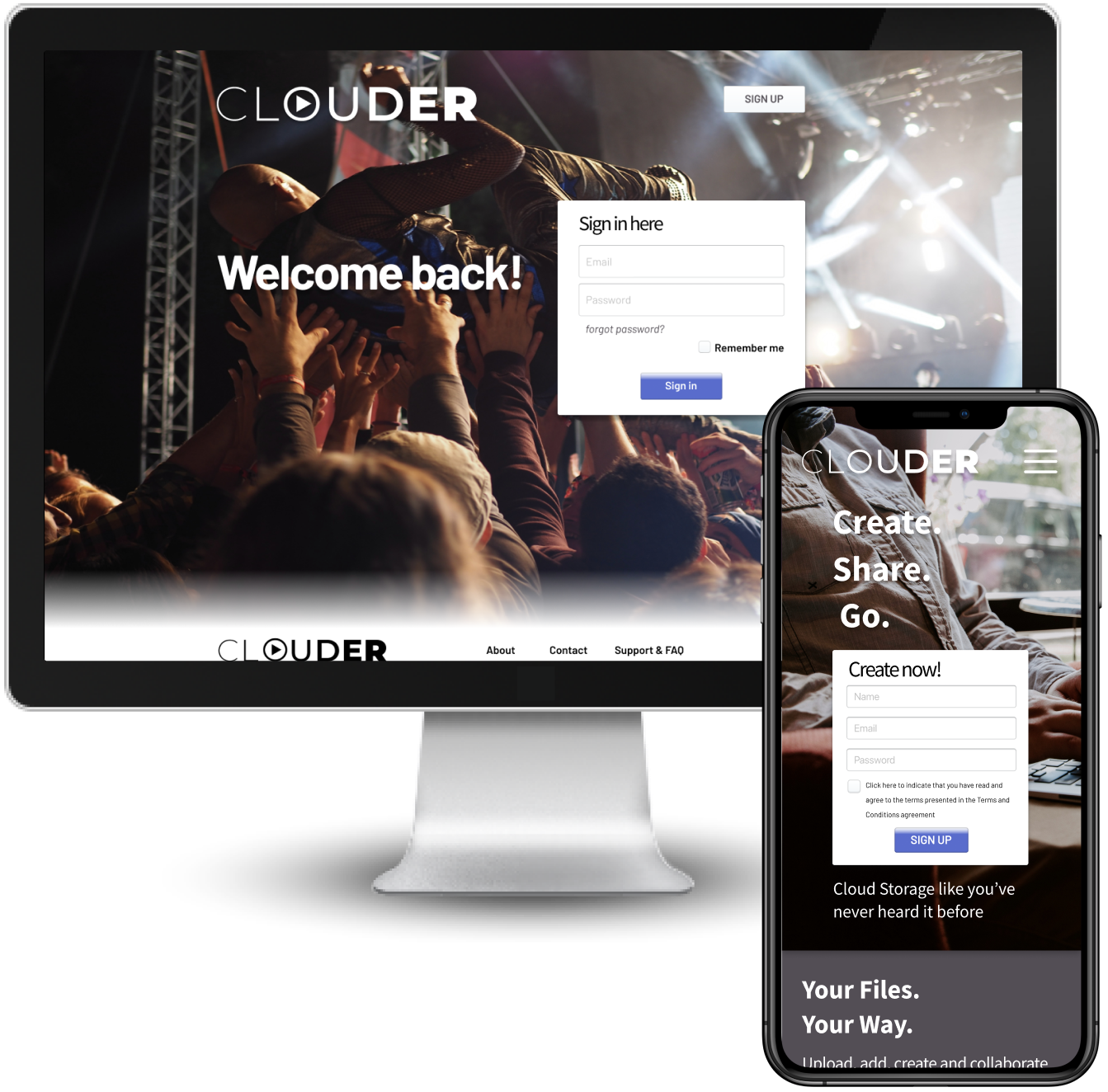
In the music industry there’s a need to create, collaborate and share concepts, ideas and data.
When people are in a room together or worlds apart, sharing data is as easy as a click of a button, while the former two (create and collaborate) aren’t as simple.
With the advent of technology and communication platforms creation and collaboration should be easier, when people are worlds apart.
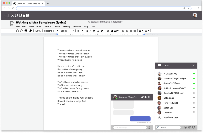
Clouder aims to meet the data capacity of all file types, the ability to create content inside the application with more than one user, all while able to collaborate in a safe and secure place.
PROJECT ROLES
- UX Design
- Visual Design
- Branding & Identity
DELIVERABLES
- User Surveys
- Competitive Analysis
- User Personas
- User Flows
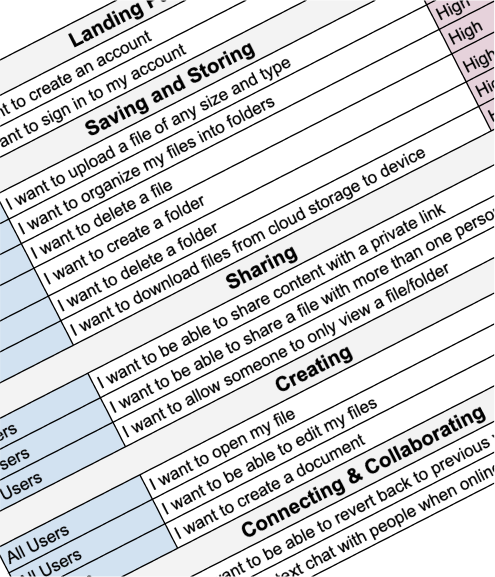
- User Stories
- Wireframes
- Concept and Identity
- Logo Design
- Style Guide
- Mood Board
- User Testing
- High Fidelity Mockups
- Clickable Prototypes
SPECIFICATIONS
- Duration
- 8 weeks
- Tools
- Figma
- Sketch
- InVision
- Adobe Creative Suite
- Google Forms
- Usability Hub
THE PROBLEM
The challenge we ran into was that there weren’t any
limitations on how far I could push the overall project.
Our main constraint was the lack of direction that Clouder
wanted to go in.
Effectively we could have moved in any
direction which lends itself to scope-creep.
Building out an entire brand from scratch required a long
list of tasks and tools to be used in building the whole
company from the bottom up, took a lot of time and a
plethora of platforms to build the project.
THE SOLUTION
Conducting user research and constantly utilising preference
testing proved to be our biggest asset in making decisions
about direction and deliverables.
Through this technique I pinpointed our target market and
built out from there, creating a site that offers storage,
sharing opportunities,creation and collaboration.
From sign in to upload, I have created a site that was easy
and productive.
DISCOVERY PHASE
USER SURVEYS
I started with user surveys to gather what our target audience would be,
by gathering my survey takers from personal contacts, social media
and forum platforms.
It was important that I targeted as many cloud storage users that I knew I
could find, so that I could learn more about what worked and what didn’t.
I needed some key information, such as:
- What features were most important to a user?
- Why a user was having to use more than one cloud storage service?
- When were they using cloud storage (personal, business, both)?
- Where were their frustrations with their current services? and;
- How their current experience with cloud storage could be improved upon.
- 30% of non-users didn’t use cloud storage because it lacks features they want?
- 34% of users use multiple platforms to access their data
- 50% of people paid for cloud storage
- 65% of users used more than one service for cloud storage
- 75% of users choose their app/s because of features
- 84% said it was important to collaborate and create inside storage space
- 87% said that accessing a cloud storage service from their app was important
- 91% believed they may be more successful if they could collaborate
After analyzing the data from the survey. I learned that a critical number of
cloud storage users were unhappy with their main service, because it didn’t
provide them with enough room for creation and collaboration that would warrant
paying for a service just to house data.
It was clear that users were using multiple cloud storage services to target
specific actions, but weren’t able to find a service that would house all
their needs into one service.
COMPETITIVE ANALYSIS
I wanted to see what companies not only held data,
but curated it - allowing users to share, create and collaborate in the service.
I put 4 companies under the microscope:
- - Patreon
- - Splice
- - Dropbox
- - Soundcloud
With Google Drive and Dropbox being the most well-known of the five, their combined
limitations on file types and size left a user for wanting more.
Meanwhile Patreon and Soundcloud offered a platform for showcasing their data so
others could contact the user for collaboration or creation,
but lacked a backend storage facility.
Splice was geared towards production and recording but also didn’t offer much in the
way of storage or creation inside the application.
USER PERSONAS
To gain greater perspective of our users needs, we needed to know who my main audience was, and how we were going to serve them to combat their current frustrations and what was going to keep them interested and motivated about Clouder.
Motivations
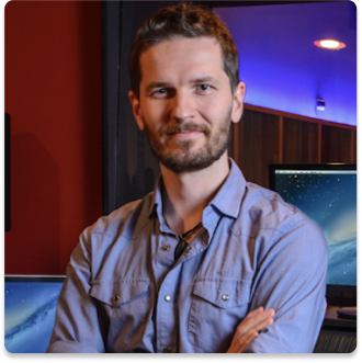
Ross never has a dull moment. He's already got his hands full with two kids
and needs to be able to house all his music and inspiration in one location
without the need for changing apps and sites. Since he's always on the go,
Ross is looking for high-end application to make life easier, simpler and more efficient.
Goals
- - Create folders/files for different projects
- - Collaborate in real-time with writers and artists.
- - Revisit older versions of files.
Frustrations
- - Limitations to certain files types
- - The inability to open a project without the application that was initially used to create the project.
- - Possibility of Intellectual property being compromised.
- - Inability to collaborate with others without being face-to-face.
- - Lack of in-app communication between project collaborators.
"Inspiration pops up everywhere, so when an artist can create and collaborate in the moment and on the go, Inspiration is captured in the most organic way."

Motivations
Calvin knows what efficiency is. After finishing his Masters in Science he is heavily focused on creating content
without any distractions.
He wants to make up for as much lost time as possible and wants to collaborate with the world.
He wants to keep moving without losing the ability to be available on the go.
Goals
- - Track shared content
- - Keep work, school and hobby content separate
- - Share content via a link
Frustrations
- - Absence of ability to track versions of a project (history).
- - Difficulty organizing content.
- - Withholding the information about who has access to a project/files and;
- - Trusting website security.
"It excites me."
Although all users utilized cloud storage in different fashions, their combined
frustrations were fairly similar across the board. It was important to know their goals, but it was
paramount that we address their pain points, even when they weren't fully aware of verbalizing
what it was that was bothersome.
INFORMATION ARCHITECTURE

SKETCHING & WIREFRAMES
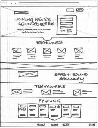
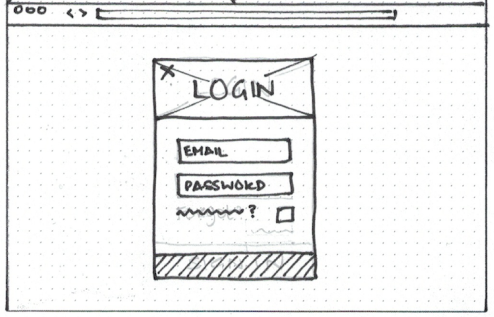
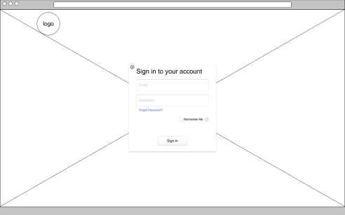
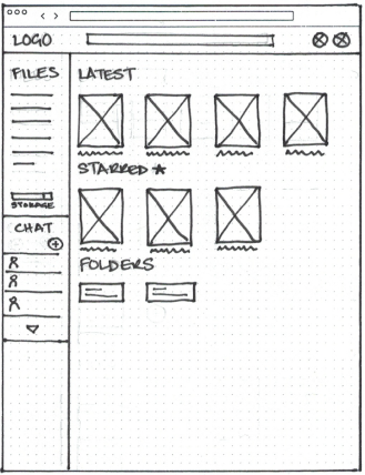
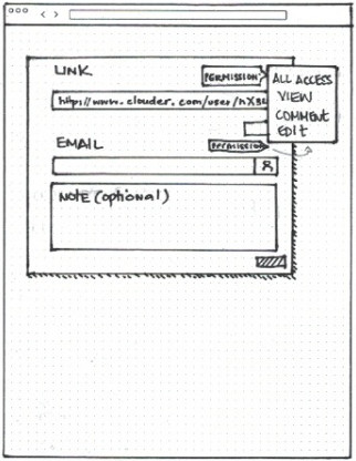
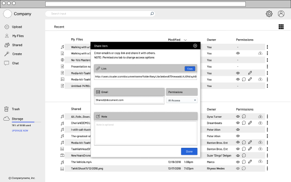
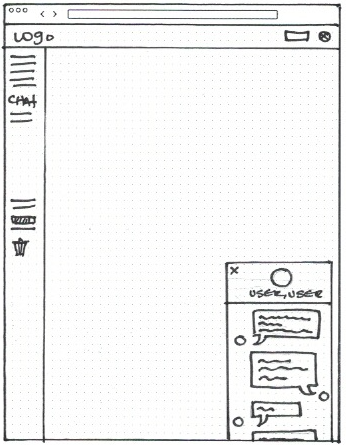
Starting with sketches, I researched different sites to see how they offered
their platform and what inspiration we wanted to use for the direction we were
heading.
After sketching the bones on paper we mocked them into a prototype to begin our
first round of usability testing.
I played with 4-UP sketching before jumping into more vivid versions.
This opportunity to play so freely with paper and pencil offered up a natural
tendency to sketch without thinking too hard about previous designs while
allowing some imagination to run free with possibilities.

LOW FIDELITY MOCKUPS & PROTOTYPING
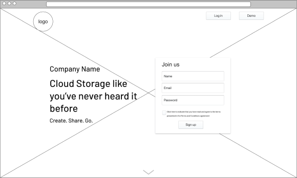
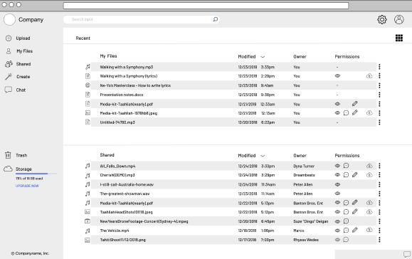
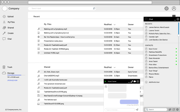
From the sketches I built out low fidelity mockups to then put into a clickable prototype.
I wanted to ensure the wireframes were functioning as I had intended them to,
ensuring that I was being as user-friendly as possible so that I would lower
the change of abandonment.
I conducted my first round of user testing after deploying the prototype.
It was my aim to see if my current design was simple and clear enough for users
to navigate the site in it’s barest state - and then grow from there.
The key takeaways were that the burger menu posed a problem, although users who navigated the site who were used to the burger menu were quick to spot the icon, we still needed to create a clear message that the menu was there without frustrating the user. From this insight, it was made clear that a demo button on the landing page would make the user more aware of the sites capabilities.
USER TESTING & ITERATIONS
ROUND 1
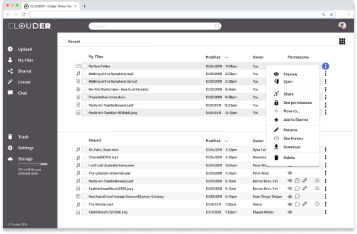
VISUAL DESIGN : HOVER BUTTON
Synthesizing the feedback from these tests helped to ensure that each revision to the
design was borne out of improving usability and not just aesthetics.
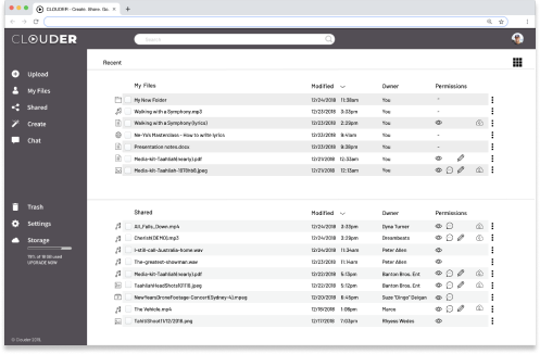
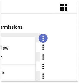
Some of the greatest feedback came was to highlight the menu and drop down iconography for
users who weren’t aware of the burger menu or dropdown feature.
To combat confusion and frustration I implemented a hover button when the mouse hovers
over the icons that weren’t as apparent to the user - this proved successful in our
second round of testing.
VISUAL AESTHETICS
BRANDING & IDENTITY
Tasked with generating the entire Branding and identity,
the goal was to create something that was clear, concise, dynamic and trustworthy.
After creating word association mind maps and composing a moodboard, I resolved
to calling the application Clouder.
I started sketching ideas that would translate the values to our desired audience.
The more I sketched, the more I felt a draw towards simpler ideas that had deeper meaning.

My final Logo iteration:
Clouder is a combination of ‘Cloud’ and ‘Louder’, which I felt spoke its purpose and
its volume.
The application allows users to create, collaborate, store and securely share their
data, while promoting a sensation of clear organization and and peace of mind.
The final logo is representative of the keywords I wanted to create as the brands values
and simple enough to be timeless.
This simplicity gives the logo the ability to be translated into various colors
and used as an inset or watermark, without the complications of being confused
by any other branding.
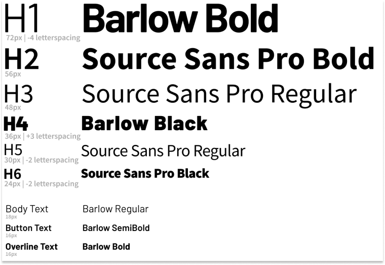
TYPOGRAPHY
It was from the type font in the wordmark/glyph that made us focus on wider,
more symmetrical typefaces.
I wanted something that would create balance, which lead me to preference test
an array of fonts.
I used usability hub and social media for preference testing.
It was here that I learned the true power of getting users to tell you about what
they want and need, and what truely appeals to them.
This priceless tool of testing,
offers up a wealth of knowledge far beyond what simple education and intuition will
provide.
Upon preference testing I chose Sans Source Pro and Barlow as the main type faces.
These two are recognizable and therefore trustworthy.
COLOR SCHEME
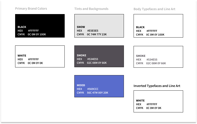
Alike the rest of the site, I wanted to keep the colors basic so that the user could
input their own magic when their creativity sparked was a key factor.
I initially applied red for a highlighter, reresenting “fire”, “creativity”, “passion”,
“drive” and “desire”, but upon my first round of usability testing, feedback suggeted
that red was “alerting: the users more than drawing their attention.
Upon mocking up our high fidelity prototype, I acknowledged that the red was creating
an alert/problem.
It was changed to a creative, trustworthy, calming blue.
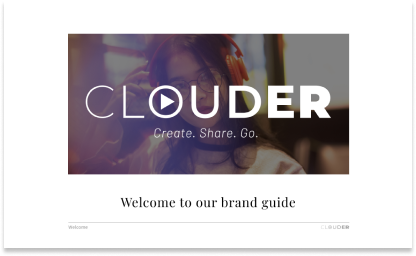
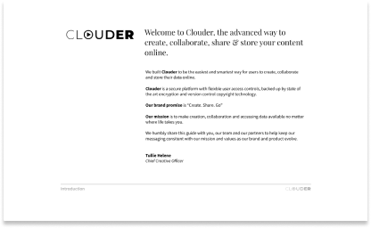
STYLE GUIDE
Building out the style guide, brought insights as an overall look of Clouder.
It offered up a wealth of knowledge about the aesthetics, and served as a constant reminder for the brands parameters.
HIGH FIDELITY MOCKUPS
After buildling the aesthetic stylistic of Clouders brand and it's guidelines,
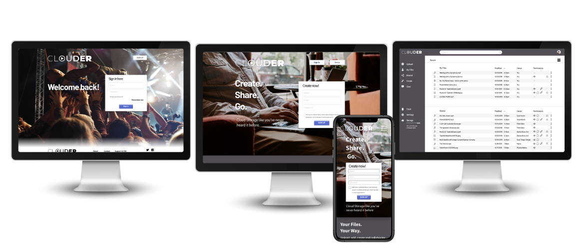
I iterated the concepts into the high fidelity mockups.

USER TESTING & ITERATIONS
ROUND 2
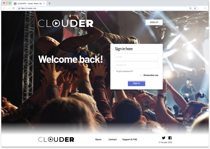
VISUAL DESIGN : LANDING PAGE
Feedback from my first round of users, there was a heavy focus on the visuals of
the landing page, and that although they could see that it was a cloud storage site,
they didn’t think the images were broad enough to include the average user and
therefore would not be engaged by the site unless they were a live musician.
Alike my search for a prefered typography choice, I deployed preference tests
into forums and usability hub to gather feedback on what people prefered.
I wanted to introduce the site to musicians as a home for their creation,
collaboration and sharing, but also didn’t want to ostracize other user who would
like to use those features in their other endeavors.
Users wanted clearer imagery about what the company was meant to achieve (Hero image),
and wanted to see images that were more concise and less metaphorical.
I gave the words and images more space to breathe.
Before

After

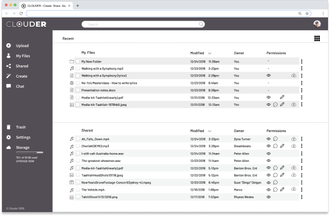
FINAL DESIGN

CONCLUSION
Clouder is a project that is close to my heart. Throughout the process,
my greatest takeaway was the value of user research and testing.
As a tool these two actions of study and listening cannot be underestimated in
creating structures and experiences that cater to the greater person than just
to rely on previous studies or personal experiences.
Through this process I was able to design a product that was user based and user driven,
while my key takeaway was to keep it simple and use the testing and research to
speak for itself before being carried away with complexities.
Thinking forward, with more time I would have liked to build out additional screens
to test the concept of forums for users. I would have liked to build more options
for a collaborative space and run user preference and testing.
My biggest challenge was in choosing and curating the imagery (albeit minimal).
I overthought, and as aforementioned learned that keeping it simple is the key.
As a whole, I am excited about this project and the insights I learned in the process.
The solutions that were rendered came from an organic place to create a solution to
the world of cloud storage.
This project proved to be challenging and fun, offering up a wealth of knowledge that
I am looking forward to blueprinting and drafting further in my future projects.

